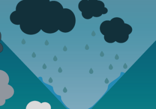
Final poster and the reflection

After I made two possible versions of the final poster, the only thing that was left that I had to do, was to decide for one. Even though I would have been fine with both, I decided for the one with the simpler heading. I did that because I did not want to draw any attention from the poster itself, as well as I thought that the design just made more sense and was less confusing (which I think is important for my target audience).

During its development, the poster went through a lot of changes. The basic design as well as the colour scheme ended up differently from what I had planned it to be. But I guess that is because I had never used Illustrator before and I just did not know what I could do with it. Even though the creation might have taken me longer then some others, I am quite happy with the result. My poster evolved from a pure sketch to something presentable, not just in theory but also reality. One of the most important parts of its development was getting feedback from my target audience. It’s always different to imagine how someone would respond to something and how they actually do it. The children made me see what changes the poster needed in order to make it more appropriate for them.

The most difficult part of it was to stick to vector graphics. The tracing of the trees took a lot of time and when I was trying to shape things certain ways, I often spend really long on understanding Illustrator’s tools. Sometimes, I would have liked to just take my Graphics tablet and draw stuff out. But I got used to it and it got easier to work in Illustrator. Looking back on the different techniques I used, the gradient one was the most difficult. I changed the gradients multiple times because I had to adapt to everything, for example changing sizes or shapes. The things we learned in our seminars helped me a lot and I got useful feedback from the tutors.

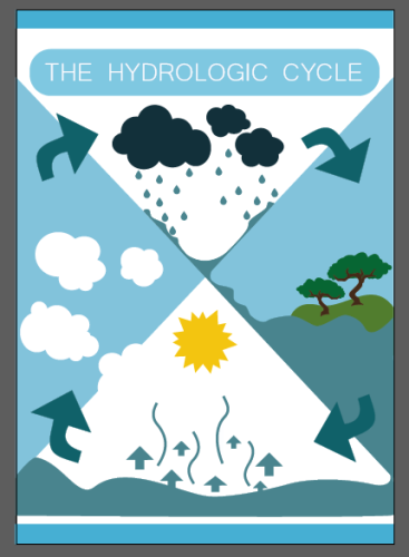
In general, I am happy with my result and the new developed skills in Adobe Illustrator. In the following, you can see the final poster.

WaterCycle2

Changing the heading

Once again, I asked people for their feedback. This time, I asked my course mates since I had the feeling that the children could not really help me when it came to the heading. As long as there was one, they did not really care about how it looked like. They were more interested in the illustrations.

My course mates on the other hand gave me really useful feedback. One of them asked me if I had tried other versions of the heading and that he could imagine it would look nice if the colours were reverted. I tried that but I struggled when it came to removing the glow. It was an effect that I had added ages before and somehow the version of Illustrator on my laptop did not allow me to get rid of it. So I deleted the whole frame and redid it.

After I changed it, I was not too happy about the way it looked like. Because the heading was really bright, it distracted from the actual content of the poster. Also, I preferred the white font colour. I changed it back to white and deleted the filling (I just left a white frame). I did it in two different ways, so I could go back to my course mates and ask for their opinion.

Screenshot (185) Screenshot (186)

There they are:

Screenshot (187) Screenshot (188)

Note: By now, I have figured out how to remove the glow. Somehow the effect turned into its own illustration and I could just select and delete it. (Photo below)

Screenshot (184)

Changing the background colour and arrows

After getting some feedback from friends and family members who were in my target group (younger children, age about 5-10), I decided to change the background colour to give my poster a less dark appearance. The children liked the colour pattern, but I found that it was hard for them to differentiate between different shapes and that parts did not stand out as much as they should. So, even though I personally liked the background colour, I did some experimenting to adapt the poster to its target audience.

In the end, I showed the children three different options. The first one was the original one with the dark gradient background. The second one was something very different. I had changed the background colour to a tone of grey. The third one was blue again. I had only changed the gradient from linear to radial and brightened the colours a bit. It was the one that the children picked in the end, even though they also liked the grey one.

Screen Shot 2015-01-08 at 17.34.59

Since I had already shown them my poster anyway, I also asked them what they liked best and if they could change something, what it would be. One of them said that arrows were missing, because it is supposed to be a cycle. The oldest one then pointed to my arrows and explained that they were there, just a bit small. That made me thinking. Obviously they were not as obvious as I thought. So, I went home, looked for some inspiration and tried it on my poster. I did not take more than one try until I was satisfied with the result. Also, I found three inspirational pictures of how I could do my arrows:

321

I moved the arrows outside of my circle but I did not want them to be seen a separate thing as well as I wanted the circular shape to still stand out most. I wanted there to be a clear outline, so the poster would not be seen as too crowded, that’s why I decided not to do them the way it was done in the first source picture. Because the fact that my new arrows were supposed to be caught by the eye right away, I ruled out the way the second picture did it. They would have been connected to the circle which might have looked nice, but defeated the goal of why I changed the arrows in the first place: The fact that I wanted to make it easier to see them. That is why I went with the third option.

Screen Shot 2015-01-08 at 17.34.59 (2)

Arrow colour

After I changed my arrows, I experimented with the colour a bit trying to find out if I was going to use two different colours, the same for all arrows or a gradient.

Screenshot (183) Screen Shot 2015-01-08 at 17.23.24

After I tried those options, I decided to stick with the gradient because the fact that it starts of bright and then slowly changes the colour to dark, leads the eye the way it is supposed to go (along the arrow). Because that process keeps repeating from arrow to arrow, the eye follows the circle.

Adding a Glow

In that step, I used light to add some shadings and glows to my poster. I used an effect called the “inner glow” for my clouds. It gave them a more three-dimensional appearance, less like clip art. Also, I changed the direction of the gradient (water), so the sea in quarter three would be brighter than the rain in quarter one. I did that because I planned to a sun/moon to visualize the evaporation and I thought it would look nice if the surface was a bit brighter.

Screenshot (179) Screenshot (180)

Another Design

After all, my colour scheme did not satisfy me as much as I hoped and because I felt like I was stuck in my process not knowing where to go and what to change, I decided to follow the advice of my tutor and just try another way to do it. First, I copied to structure into a new page (without background) and saved my original design so in case I would not like the result, nothing would be lost.

Screenshot (170)

Then I created a gradient, I liked a lot, in a darker blue then the one I used before. I still wanted to hold on to the structure of splitting my cycle into four equal parts and also hold on to the original idea of the water being in constant flow. But I thought of another idea of how to use the given space, one that I considered in the very beginning, placing the cycle in the middle by using a circle. So I cut out a circle from my background.

Screenshot (171)

What I had to do next was moving my already created design into the empty space.

Screenshot (172)

I tried to drag it in but it turned out more difficult than I expected, so I had to go a step back, taking care of the quarters first. I experimented a little and ended up really being found of a simple gradient design. It separated all the quarters from each other and used colour supporting the original idea of the flow.

Screenshot (173)Screenshot (174)

Next, I added arrows, another element to support the flow. I drew them using the tracing tool and then, I used the pathfinder tool to connect them to the quarters. The last thing I had to do was redoing the gradient, so the top of the arrow would be back to dark blue. I did that, so the arrow could be seen on the bright background as well as for a nicer look.

Screenshot (175) Screenshot (176) Screenshot (178)

After I had taken care of those basics, I started adding my content piece by piece. It took some time because I had a lot of resizing to do. Also I changed most of the Anker points as well as the colours since they had to fit into my new nicer colour scheme.

Screenshot (177)Screenshot (179)

Experimenting with Raindrops and Trees

Since the raindrops and my new coloured background would not work anymore and I thought they looked a little boring anyway, I added a gradient to all of them just to see how it would look like. I liked the idea of the slight colour change on their journey from the cloud to ground better than I thought and decided to keep it like that after I added a few minimal corrections. I made the upper ones fit the clouds colour and the bottom ones the waters colour.

Screenshot (117)Screenshot (166)

Also, I worked on my trees. I wanted to give them details, like shades and change the colour of each one individually. Also, I wanted to turn the two trees I had into a forest, so I made more duplications.
Screenshot (167) Screenshot (168)

Changing Colour Scheme and Gradients

To take the next step with my poster, I added gradients. It did not take long though until I realized that I could not keep up my previous colour scheme. Just blue and white did not look good and also, it did not work with the white clouds. So I experimented with green, since I used that colour for the trees anyway and a lighter blue instead of white. After all, I was satisfied but not completely happy with the result.

Screenshot (115)Screenshot (118)

Another thing I did was removing the lines in the third quarter and colouring the clouds depending on how close they are to raining from white to dark grey.

Tracing: Trees and Clouds

For the little forest I planned to do in the second sector of my poster, I needed trees.

I created them using what I learned about tracing in my seminar session. First I found a picture of a suitable tree online. Then I used the tracing tool to recreate the shape, so I would end up with a vector graphic. Then I used the same tree to create more of them by changing size and some details.

Screenshot (160) Screenshot (161) Screenshot (162) Screenshot (163)

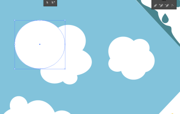
I thought about tracing the clouds as well, when I remember how in our sessions, we created difficult shapes by using normal circles, rectangles, stars or triangles Illustrator allows you create very easily. So, I tried making clouds out of a lot of white circles and ended up with that.

I considered using the same form for all of my clouds like I did with my tree but in the end I created everyone on its own. This way they looked nicer and more natural.

Screenshot (164) Screenshot (165)

In the end, I grouped all the parts of my clouds, so I could move and change them as one. The same thing I had done before for my tree.

First steps (basic version)

After I picked the topic as well as the basic design for my poster, I sat down to create the very basic version in After Effects (first picture). I cared less about the colours and the details as the positions and shaping. I liked the idea of using blue and white to create an hourglass like look. After all the water cycle is all about time and I figured that the hourglass would be a nice way to underline that. Another thing that I liked about my design was the part about the water being in a constant flow, like it is in reality (second picture). I visualized that, connecting the water from each and every part of my cycle by a different kind of flow. Looking at it closer, you realize that the rain from the first quarter flows into the lake in the second one, which again, ends up in the ocean. From there, it vaporizes into clouds which float through the fourth quarter back into the first where the water rains back down.

Screenshot (152)Screenshot (155)

Then I took the basic design to my seminar session, to get some advice about further developments and a little bit of feedback about what I had done so far. Together with my seminar teacher, I talked about the use of space and the possibility of removing the blue frame lines to either resolve the problem of it being too crowded or maybe adding a small amount of information in form of text. Also I realized that I had to change the “space holder sun”, I created into something more fitting and that shading and details were needed. I experimented with gradients and I considered using them for the background.